01
Before
- Harder to understand quickly
- Less focused visual hierarchy
- More dated presentation
- Weaker contact and booking path
Case study
A calmer, clearer website for consulting and professional support.
Overview
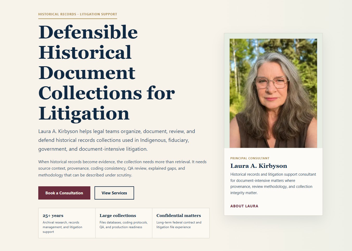
Laura needed a website that better communicated her work and felt ready to share publicly. The redesign needed to be clear, calm, professional, human, and easier to understand quickly.
The problem
The first impression needed to explain the work sooner.
The page structure needed a calmer order and clearer emphasis.
The design needed to feel credible without becoming cold.
The contact path needed to feel simple and natural.
Before / After / Why
01
02
03
Client note
“Thoughtful, communicates the business clearly, and is very easy on the eyes.”
Responsive evidence
The design challenge was to keep the page calm and credible without making the path to contact feel hidden. On mobile, the message, proof, and next step needed to stay easy to follow.
The desktop homepage is shown once as the main case-study image. This supporting capture shows how the same system carries into a narrower screen.
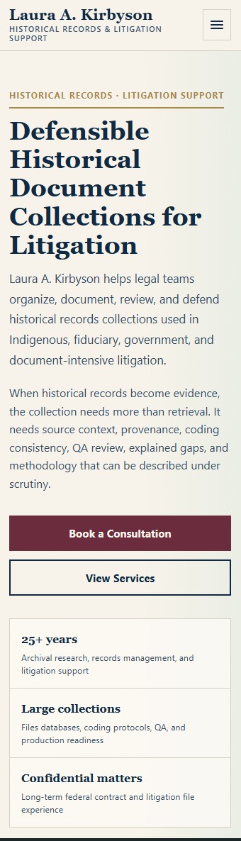
The mobile view keeps the first impression, service explanation, and contact path in a clear sequence instead of treating the narrow screen as an afterthought.
Design notes
Note 01
The page needed to feel calm without becoming quiet or forgettable.
Note 02
The writing needed a clearer order so visitors could understand the work sooner.
Note 03
The visual rhythm needed more space around key ideas and a more obvious path to contact.
Note 04
The design needed to feel professional and human, without leaning on generic consultant-site patterns.
What it shows
This project shows how structure, writing, spacing, and visual restraint can make a site easier to trust. It is less about adding more and more about putting the right things in the right order.
Back to workStart here
Email me a little about your business and what you want the new site to do. I'll come back with what I'd recommend.
Start a conversation